COVID Death Analysis
A data analytics project exploring global COVID-19 deaths and trends using Tableau and Python.
About this project
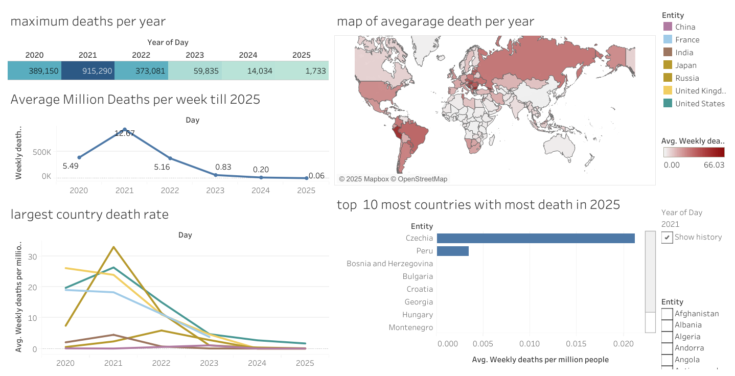
This project analyzes worldwide COVID-19 death data to identify trends, affected regions, and mortality rates over time. It combines Python data wrangling with impactful Tableau dashboards to communicate key insights.
Technologies Used
- Python (Pandas, Matplotlib) for data cleaning and exploration
- Tableau for creating interactive dashboards and storyboards
Key Features
- Identifies top countries with highest and lowest death counts
- Calculates death rates and case fatality ratios by country and globally
- Animated time-series maps to show spread over time
- Interactive Tableau dashboards for deep dive analysis
Sample Visuals
Insights & Outcomes
- Countries like the USA, Brazil, and India recorded the highest deaths. - Significant mortality disparities were found linked to healthcare infrastructure. - Animated maps helped visualize waves of the pandemic over months.
See It Live
You can explore the interactive dashboards on my Tableau Public profile, or view the source data processing code on my GitHub repository.